
|
|
|
|
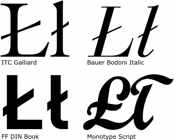
Kreska ukośna is appears only in the letter ł (lslash, barred l, pronounced ew). This letter should not be drawn like the British pound sign! It is one of the most difficult and badly drawn characters ever, probably because of its illusional simplicity. |
|
|
There seem to be two different approaches to draw the Polish small ew. |
|
|
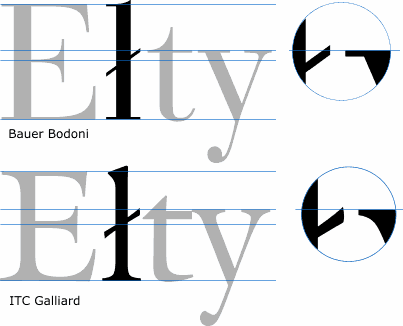
One of approaches is traditional, where the stroke is visually centered on the l. This is the approach I prefer, as it guarantees the required minimum of decipherability of the ew glyph against the small t letter. Many typographers follow this rule, among them Stefan Szczypka, who has drawn many of the diacritics used in this manual. |
|
|
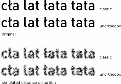
The second, unorthodox approach has been proposed by Polish typographer Andrzej Tomaszewski, the son on Roman Tomaszewski (R.I.P.), the famous Polish typographer and long-year member of ATypI board. This approach suggests that the stroke of ew should cross l at the height of the t stroke. The rule is simple, but, as I stated above, the simplicity is illusional. The danger of this method is, that the ew glyph may be easily misread as t. It also gives a kind of "distorted" small caps line. Kuba Tatarkiewicz, who has prepared several hundred fonts for use in Poland (licensed from Bitstream and ITC) follows this method. |
The above sample shows several samples with ew created following the classic and the orthodox method. The second sample shows a simulated distortion when the letters are viewed from a range. The word "cła" can be easily misread as "cta" when ew is created following the unorthodox method. The classic method guarantees that ew and t remain distinguishable. |
|
My opinion and recommendation is that the tradidional rule should be followed in any case. This method will be illustrated in detail. The stroke in small ew in serifed faces should cross the stem of ew at the visual center of the letter. The analogy of the middle stroke in capital E is usually helpful. The angle of the sloping stroke faces should be usually around 30 degree from horizontal. It should not be too steep (45 degree or so). If the stroke ends somewhere around the x-height, it should usually reach slightly above that line. |
|
|
The visual center rule has priority over the x-height rule. |
|
|
The ew stroke in sanserif typefaces ends similarily to other sloping elements, i.e. small x. Most sanserifs will have ew strokes which ends vertically, not sloping. The ew stroke should always maintain the thickness of the thin element of the typeface. Sloping elemnts, like those in w, k, or x, are good reference. |
|
|
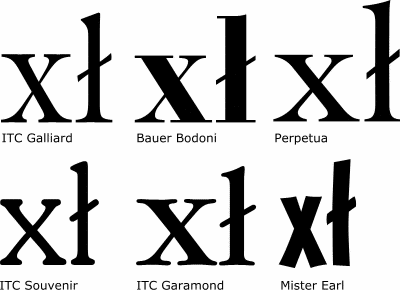
The ew stroke in serif faces should end similarily to the serifs. If the serifs are sharp, the stroke should end sharply, usually with a vertical cut. If the serifs are rounded, the ew stroke also goes off round. The ew in display faces should be compatible with the remaining type. |
|
|
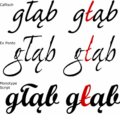
Small ew in script typefaces is the mostly misdrawn ew. While it is being often drawn with a short stroke in the middle of the letter, the proper calligraphic style makes the stroke to a short or sometimes even longer, calligraphic stroke above the letter l or at its top. The stroke is sometimes wave-shaped. Please compare the beautiful ew drawn for Monotype Script by Andrzej Tomaszewski with the original letter l: the proper ew has the l shortened and without the "cycle". |
|
|
Before we go to capital ew, I will show you a real rarity: an ew-ew ligature. As you can easily see on the first image, the strokes of two consecutive ews overlap. They should be substituted by an ew-ew ligature as shown on the second image. This would be an interesting case for the OpenType ligatures mechanism. |
|
 |
|
|
To be continued (about capital ew) |
|


[Introduction] [Kropka] [Kreska] [Ogonek] [Stroke]