
![]()
![]()
![]()

![]()
![]()
![]()
![]()
![]()
![]()
![]()


Typedesign.CE
Ten years after the transition from communism, we are experiencing a Renaissance of type design in Central European countries: Poland, Czech Republic, and Slovakia. By Adam Twardoch
After World War II, typography of Central and Eastern European countries was not well known to the Western world. The political transformation of 1989 offered the first chance to present the historical and contemporary developments to a wider audience. However, in the early and mid-1990s, post-communist countries were experiencing serious transition problems, combined with the public’s fascination with all things Western. As a result, local graphic design was not the primary focus.
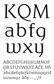
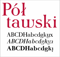 Antykwa Poltawskiego/Poltawski; 1928, by Adam Jerzy Poltawski, Poland; sample from a free font by J. Nowacki, B. Jackowski, P. Strzelczyk; Polish TeX users’ community (GUST)
|
Only now — in countries where political and economic situation has become more stable, and the public has appeased its hunger for primary consumer goods like clothing, cars, or home electronics — comes a time where more attention is paid to visual style.
A century in review
Excluding the former
Soviet Union, the Central and Eastern European countries that created
pronounced individual styles in printing and typography were Poland and
the Czech and Slovak Republics (formerly Czechoslovakia). In the beginning
of the 20th century, each of these countries had developed the first truly
original, high-quality typefaces. Czech type designer Vojtech Preissig and
Poland’s Adam Jerzy Poltawski were the pioneers who set out to define
their respective national typographic styles in terms of the post-World
War I reality.
The pioneers
Poltawski designed
his Antiqua face, Antykwa Poltawskiego, in 1928. This first truly original
Polish typeface was initially cast in 1931 at the Idzkowski foundry in
Warsaw. Poltawski made an attempt to create a typeface that would be
particularly suitable for setting copy in the Polish language. He spent
several years examining the differences between the appearance of text in
Western and classic languages (English, German, French, and Latin) vs. in
Polish. He collected and created samples set in some popular typefaces,
and found out that specifically the letters “w,” “y” and “k,” which are
used rather frequently in Polish, make copy set in this language appear
somewhat distorted. As a result, he decided to develop more curved,
regular forms for those letters in his typeface, as well as to design
unorthodox, classic forms of these letters for use in other languages.
 Preissig Antikva; 1925, by Vojtech Preissig, Czech Republic; sample from a font version reworked and digitized by F. Storm and O. Karlas, Storm Type Foundry
|
Although Poltawski’s basic considerations and conclusions could not be found groundless, their realization (i.e. the typeface itself) was widely disputed. While the roman style surely exhibited some prettiness and individuality, the italics were clearly underdeveloped. Nevertheless, after World War II, Antykwa Poltawskiego was redrawn and cast by the Polish state type foundry, becoming Poland’s most popular book typeface. It was also cast for hot setting by the Monotype Corporation, being the only Polish export typeface.
A typeface which was just as controversial — and as interesting — as Antykwa Poltawskiego was designed by the Czech typographer Vojtech Preissig between 1923 and 1925. While Poltawski’s motivations were of a purely linguistic nature, Preissig was also devoted to style, to creating a new visual quality. He spent more than 20 years in Paris, and later in the United States, where he had drawn several typefaces and designed a series of ornaments. His only book typeface, Preissig Antikva, was cast in 1925 at the Czech State Printing Office foundry in Prague, where he had returned to settle in 1930. This extraordinarily vivid and elegant face was a creation in the spirit of the late Art Nouveau, reminiscent of William Morris and the ideals of the Arts and Crafts movement. It was also a milestone for Czech type design and served as inspiration for later developments, including typefaces by Menhart, Ruzicka, and Tyfa.
It is not surprising that fonts by Poltawski and Preissig were the first to attract the interest of type designers in the 1990s. Preissig Antikva has been digitized independently by three different groups of designers: the Czech Frantisek Storm and Otokar Karlas of the Storm Type Foundry, as well as by two US “grunge” foundries, P22 and Psy/Ops. Antykwa Poltawskiego has been digitized first in 1996 by a German designer Felix Tymcik. The second approach to Poltawski comes from Boguslaw Jackowski, Janusz Nowacki, and Piotr Strzelczyk of the Polish TeX users’ community (GUST), whose goal is the preservation of Polish national typographic heritage by making the font freely available to the public in a number of formats, including Multiple Master.
|
|
The communist era
After World
War II, the printing industry in Central European countries was
nationalized. There was not much room for typeface development, both
because of the political trends of global unification and the
technological “backwardness” of the printing industry. Nevertheless, a few
individual developments stamped a remarkable seal on the type industries
of these countries. Most notable were the activities of the
Czechoslovakian state type foundry Grafotechna and the Polish typeface
development center Osrodek Pism Drukarskich (OPD).
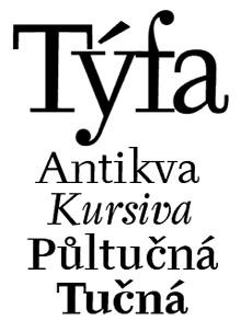
Grafotechna, established in 1951 based on several private type foundries which were nationalized after the war, was a birth place for many highly talented typographers — a place absolutely unique in the existing communist block. The type foundry commissioned numerous Czech designers to create typefaces of various kinds. Menhart, Tyfa, Ruzicka, and others, created a series of beautiful fonts with strong individual styles. Perhaps the most famous and successful typeface cast by Grafotechna was Tyfova Antikva designed in 1959 by Josef Tyfa.
The roman version of this brave modern typeface was accompanied by a very handsome italic, with the distinguishing feature of a strong contrast between the thick and thin parts of each letterform. Tyfova Antikva was inspired by the work of architect P.L. Nervi. The digital version was prepared in 1995 by the Storm Type Foundry under the supervision of the original designer. The States’ International Typeface Corporation (ITC) recognized the global character of this font family and released it in 1998.
|
|
OPD was founded in Warsaw in 1969 under the direction of the Polish type designer and long-term Association Typographique Internationale (ATypI) board member Roman Tomaszewski. Until 1976, it existed as a research center of the state printing industry, gathering a group of Polish designers involved in lettering with a goal of creating a series of new typefaces for use in printing. Before OPD, very few original typefaces were designed in Poland. A major moment in the existence of this typeface development center was a font design contest held in March 1971 in Dresden, East Germany, where several Polish fonts designed at OPD specifically for that event received awards.
One of the most interesting typefaces developed under the auspices of OPD is Alauda, designed by Jerzy Desselberger, who is a world-renowned specialist for Middle European… birds. As a member of international ornithological associations, Desselberger writes about birds, supplementing the texts with beautiful illustrations. He occasionally deals with type, and Alauda — Latin for “lark” — is one of his typographic creations. This intricately drawn, beautifully clear typeface bears a strikingly modern appearance which remains fresh after 30 years. Although slightly slanted, Alauda retains its balance by using half-serifs. In essence, Desselberger follows Poltawski’s design postulates, but does so far better and more consistently than Poltawski himself has ever done. Initially, Alauda has been meant for release on photosetting, with Desselberger having prepared three styles (roman, italic and bold), with over 350 characters each. Unfortunately, the typeface has never been released, and OPD has ceased to function in 1976 due to a financial crisis. Currently, Desselberger is working with this author on a digital version.
Designed around the same time, Bogdan Zochowski’s Glowworm became one of the most commonly known Polish fonts of the period. Along with several others by the same designer, Glowworm was available on dry transfers of Mecanorma, and remains available today as a digital font ‹ from both Mecanorma and Agfa Monotype.
|
|

Current trends
Digitizing fonts
The
aforementioned historical typefaces created in Poland and Czechoslovakia
during the 20th century led to the first of three mainstream movements in
current Central European typography — the creation of digital versions of
existing typefaces previously available only as drawings or matrices.
Since there are no large foundries in these countries, digitizing is being
carried out in various forms. Some are one-man projects, such as those
undertaken by Frantisek Storm of the Storm Type Foundry, while others are
the result of a Western foundry commissioning the work. There are also a
few computer- or type-related organizations, such as the aforementioned
Polish TeX community, which also take on such projects.
Localization
Localization is the
second major trend in the region. The languages spoken in the countries of
Central Europe are mostly Slavic and use Latin-based alphabets with
certain modifications — accents, dots, hooks, bars, etc., commonly
referred to as diacritics. However, most of the fonts available in the
international foundries are supplied only with a basic character set (i.e.
Latin-1 encoding), which does not cover the characters needed for
typesetting in Polish, Czech, Slovak, and other local languages. As such,
the fonts must be localized, adding the needed characters. This requires
linguistic and historical expertise, as well as experience in type design.
|
|
Unfortunately, most of the localizations performed by the original authors of Western fonts, or by the original foundries, are of mediocre quality. It is quite clear that far less time and dedication has gone into the localization of the fonts than that invested in creating the original designs. As a result, even the limited assortment of localized fonts offered by the largest and best-known font houses features accents which do not match proper local letterforms, resulting in a disharmony which not only destroys the optical effect of a given typeface, but also hinders readability. This causes the need for “post-localizing” such fonts by local design studios. Once again, preparing such “secondary” localizations is only possible in studios which have the required expertise. Further, it is very time-consuming and greatly increases the cost of a given design project, especially if a font is to be used occasionally or, worse yet, only once. Given the fact that the markets of Central European countries are much more price- than quality-oriented, this approach inevitably fails. Thus, badly localized fonts are used commonly. This not only adversely affects the quality of presentation, it impairs the reader’s perception of the text and prevents him or her from developing “good taste,” if you will — i.e., a “feel” for typography and its proper appearance.
The solution for font houses would be to consult the local experts in preparing the initial localized versions, or to commission the localizations of their fonts to local experts. Fortunately, some of the major foundries have begun to practice this approach, at least occasionally. A complementary strategy would be to study recommendations and guides published by typographers who specialize in localization of typefaces. Such guides are readily available online. For instance, one of them has been prepared by this author and is available at Font.org.
The Renaissance of type design
The third significant trend in Central European countries, is, as in
most other countries, developing original typefaces. In that field, the
former countries of Czechoslovakia (now the Czech Republic and Slovakia)
clearly take the lead over the twice-as-large Poland. At least two
significant type designers are active there, one for each of the
post-Czechoslovakian countries.
The most fertile typographer of the Czech Republic is indisputably the aforementioned Frantisek Storm. His foundry has developed and distributes over 200 fonts created by this talented designer. While some of them are digitized versions or revivals of Czech classics, such as Preissig and Tyfa, others are original creations that are highly individual, versatile, and vigorous. These include text faces such as Biblon, Genre, and Serapion, as well as display and fun fonts like Bahnhof, Farao, and Zeppelin.
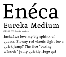
Slovakia’s most successful type designer is probably Peter Bilak, who lives in Holland but maintains strong ties with his country of origin. His numerous typefaces are available from FontShop International (Atlanta, Eureka, and Masterpiece), from Typotheque (Champollion, Eureka Mono), and from his own website (Didot Sans).
Other contemporary type designers from the Czech Republic and Slovakia include Filip Blazek, who also created Typo.cz, an exquisite guide on Czech and Slovak typography, Ales Najbrt, and Martin Sutovec.
|
|
The typographical creations of Poland are somewhat less impressive. While there are some ongoing projects in the art academies of Warsaw, Gdansk, and Cracow, it seems that the only designer who has actually released his fonts is Dariusz Nowak-Nova. His display typefaces Fresh Ewka and Nowe Ateny have been released by the Linotype Library.
Another talented designer, Artur Frankowski, currently teaches typography at the Technical University of Warsaw and is working on releasing his typographic creations, which he has been working on for several years. Frankowski plans to publish his fonts on his website under the name Magdart Fonts (MF).
Type design in the countries of Central Europe is still in a very early stage. During the recent years, the advent of digital typography has caused most efforts to be put into securing the national heritage of these countries — by digitizing the most famous fonts designed in Poland and Czechoslovakia in the 20th century. As such, there are still only a few original typefaces coming from the region, but some very promising bright stars are on the horizon.
©2000, Adam Twardoch
Premiered in Visual Arts Trends eS
![]() index return to the
main editorial index page
index return to the
main editorial index page![]() interact comment on this
article
interact comment on this
article![]() subscribe to
Visual Arts Trends eS for free
subscribe to
Visual Arts Trends eS for free![]() subscribe purchase an annual subscription to the quarterly trends
reports
subscribe purchase an annual subscription to the quarterly trends
reports